Web Technologies 2026 · BiUH · Lesson 2
HTML
HyperText Markup Language
Document structure · text · links · images · tables · forms · semantics
Seven parts, one picture
What this lesson covers.
| 2.1 | Document structure — the skeleton every page has |
| 2.2 | Text and typography — paragraphs, lists, quotes |
| 2.3 | Links and navigation — the element that made the web |
| 2.4 | Images and media — paths, alt text, formats |
| 2.5 | Tables — for data, and only for data |
| 2.6 | Forms — where user input enters your site |
| 2.7 | Semantic HTML — saying what things are |
Full lessons at webtech.landrock.io/course — these slides are the spine, not the detail.
HTML does not describe
what a page looks like.
It describes what each part is — a heading, a paragraph, a quotation, a navigation menu.
Appearance is CSS's job. Keeping those separate is the single most important idea in this phase.
Lesson 2.1
Document structure
Every page you will ever build starts here
<!DOCTYPE html>
<html lang="en">
<head>
  <meta charset="UTF-8">
  <meta name="viewport" content="width=device-width, initial-scale=1.0">
  <title>Page title</title>
</head>
<body>
  <!-- everything people see -->
</body>
</html>
Type it by hand once. After that you will recognise it anywhere.
The four lines that are not decoration
<!DOCTYPE html>"this is modern HTML" — without it browsers fall back to 1990s behaviourlang="en"tells screen readers which language to pronounce, and search engines who it is forcharset="UTF-8"without it, 中文 and emoji turn to nonsenseviewportwithout it, phones render your page at desktop width and shrink itFour lines. Each one prevents a real, visible failure.
head vs body
<head> — about the page
Title, character set, viewport, stylesheets, description.
Nobody sees it. Machines read all of it.
<body> — the page
Everything a person actually looks at.
If it is visible, it is in here.
The browser tab shows the title. That is the head leaking into view.
Headings are an outline, not font sizes
One h1. Never skip levels.
✓ An outline
<h1>My site</h1>
  <h2>About</h2>
  <h2>Projects</h2>
    <h3>First project</h3>
✗ Chosen by size
<h1>My site</h1>
  <h4>About</h4>
  <h2>Projects</h2>
    <h5>First project</h5>
A screen reader user can jump between headings to navigate. Skipping levels breaks that. If you want smaller text, use CSS.
Lesson 2.2
Text
Where most of the web actually is
Two that look identical and are not
Meaning
<strong>Warning</strong>
<em>really</em>
A screen reader emphasises these aloud.
Appearance only
<b>Warning</b>
<i>really</i>
Bold and italic pixels. No meaning attached.
Both look the same on screen. Only one survives being heard instead of seen.
Use strong and em by default. Reach for b and i only when you truly mean "just style it".
Lists — three kinds, and the third is forgotten
<ul>unordered — order does not matter<ol>ordered — steps, rankings, anything numbered<dl>description list — term and definition pairs<blockquote> <cite>a quotation, and where it came fromA navigation menu is a list of links. So is a table of contents. So are most sidebars.
Once you see it, you will notice lists everywhere in real markup.
Lesson 2.3
Links
The element that made the web a web
Five things one element does
<a href="about.html">About</a>            another page of mine
<a href="../index.html">Home</a>         up one folder
<a href="https://mdn.io">MDN</a>         someone else's site
<a href="#sources">Sources</a>           a place on this page
<a href="mailto:me@example.com">Mail</a> open a mail client
Every other element describes something on your page. This is the only one that reaches off it.
Relative vs absolute — this decides whether your site survives
Relative — your own pages
about.html
images/photo.jpg
../index.html
Still works when the site moves to a server.
Absolute — other sites
https://example.com/pageThe full address. Required when leaving your site.
Hard-coding your own laptop's path
is how sites break on deployment.
Link text is read out of context
"Click here" tells a screen reader nothing.
✗
To see my work,
<a href="work.html">click here</a>
✓
See <a href="work.html">my
recent projects</a>
Screen reader users often pull up a list of every link on the page. A list of twelve "click here" entries is useless.
Lesson 2.4
Images
Two attributes · one of them is not optional
Every image needs both.
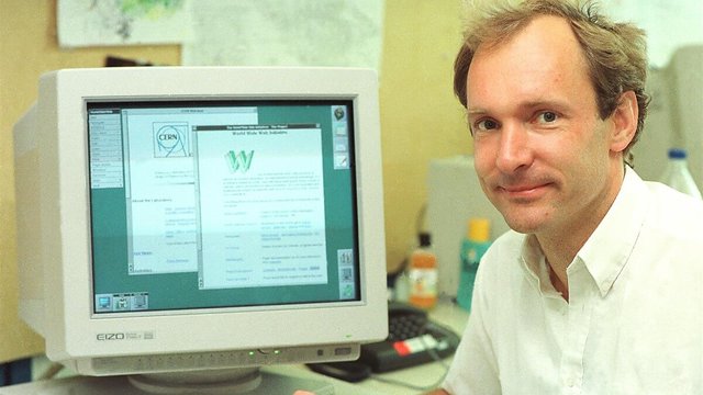
<img src="tim.jpg"
     alt="Tim Berners-Lee at CERN">
src — where the file is
alt — what it shows
Write it as if you were describing the picture to someone on the phone.
Purely decorative? alt="" —
empty, but present.
Lesson 2.5
Tables
For data. Only for data.
The structure, and why each part exists
<table>
  <caption>What this table shows</caption>
  <thead>
    <tr><th>Week</th><th>Topic</th></tr>
  </thead>
  <tbody>
    <tr><td>1</td><td>Fundamentals</td></tr>
  </tbody>
</table>
<th> is not "bold cell". It tells a screen reader
this labels the column — so every cell below can be announced with its heading.
Tables are for data.
Train timetables, price comparisons, results, schedules — anything with rows and columns that mean rows and columns.
Never for page layout.
That was 1998's solution to a problem CSS Grid now solves properly. A layout table read aloud is incomprehensible.
Lesson 2.6
Forms
Where the user talks back — and where security begins
Every input needs a label. No exceptions.
✗ Placeholder as label
<input placeholder="Email">Vanishes as soon as they type. Screen readers may skip it.
✓ A real label
<label for="email">Email</label>
<input id="email" type="email">
Always visible. Clicking it focuses the field.
The for and the id must match. That pairing is the whole mechanism.
Input types do work for you
type="email"validates the format, and phones show an @ keyboardtype="tel"phones show a number padtype="date"a real date picker, freetype="number"with min, max and steprequiredthe browser refuses to submit without itpattern="…"your own rule, checked before sendingChoosing the right type gives you validation,
the right mobile keyboard and accessibility for free.
But client-side checks are convenience, not security. Anything real must be checked on the server too.
Lesson 2.7
Semantic HTML
The idea the whole phase has been building toward
Identical on screen
Says nothing
<div class="header">
  <div class="nav">…</div>
</div>
<div class="main">
  <div class="post">…</div>
</div>
Says what it is
<header>
  <nav>…</nav>
</header>
<main>
  <article>…</article>
</main>
Same pixels. A class name means something to you; an element name means something to every machine that reads the page.
When you are unsure which element
Ask in this order.
Is it the main content? → <main>
Does it stand alone? (a post, a product) → <article>
Is it a themed part with a heading? → <section>
Is it only loosely related? (sidebar) → <aside>
Intro or meta content? → <header> <footer>
None of the above? → <div>
<div> is not wrong — it is the honest answer when nothing more specific fits.
Who is reading your markup
People
Some with screen readers, some navigating by keyboard, some on a phone in bright sun.
Search engines
Deciding what your page is about, and whether to show it.
Machines
Preview cards, readers, and increasingly AI agents fetching and summarising pages.
All three want the same thing: a page whose structure states what it is.
Which is why semantics matter more in 2026 than they did in 2016, not less.
Lesson 2 · done
What you should be able to say now.
- What each line of the HTML skeleton prevents
- Why headings are an outline and not font sizes
- When a path should be relative and when absolute
- What
altis for, and how to write it - Why every input needs a real label
- Which element to reach for — and when
<div>is the right answer
The full lessons, with the detail these slides skip.