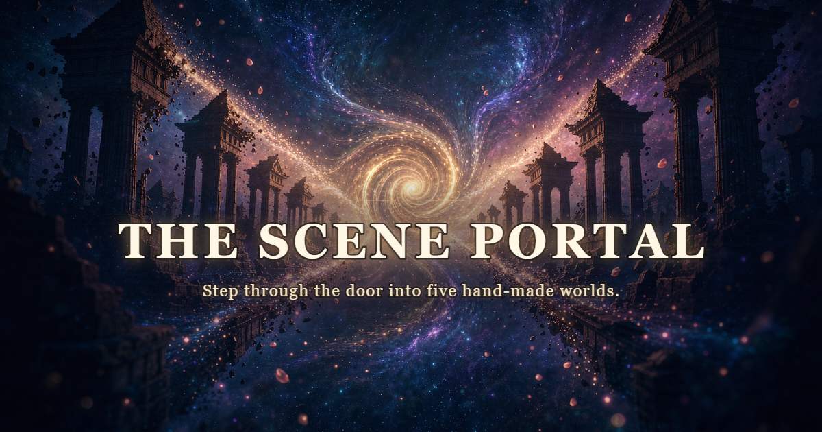

The Scene Portal
An interactive 3D globe: pick a place, step through the portal and stand inside a 360 degree panorama.
by WANG Jingwen
Description
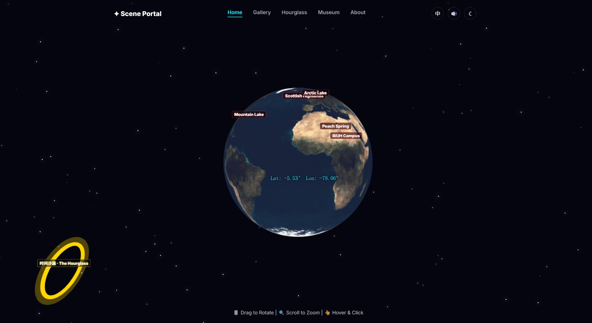
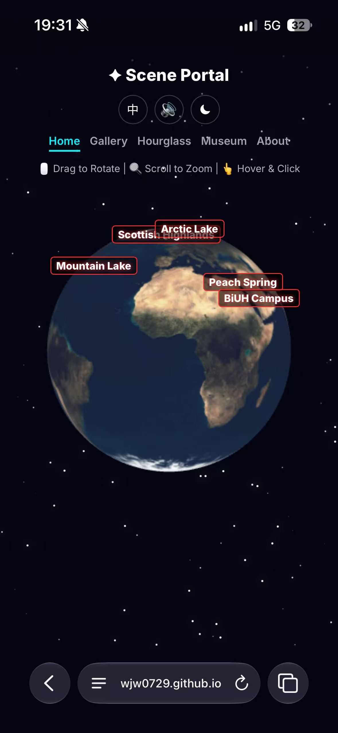
What it is. The Scene Portal is a small website about the feeling of going somewhere else without leaving your chair. A 3D globe shows five places. Click one, a door opens, and you are standing inside a full-screen 360° panorama: a peach grove, the Scottish Highlands, a frozen Arctic lake, a mountain lake at sunset, and my own campus. A separate "Hourglass" leads to a drawn-time corridor where you can walk through six eras, from prehistory to a future spaceport, talk to the people there and pick up small objects. Who it is for. I built it for the students in my web-technology class — people who will open it on a laptop in a lab, but just as likely on a phone between lectures. That is why every page works at 390 px wide, why the panoramas are compressed from 114 MB of source PNGs to about 4 MB of JPEGs, and why the scene pages have touch controls: drag to look around, and two on-screen arrows to move. How I built it. It is plain semantic HTML, CSS and vanilla JavaScript with no framework, no server and no database. Three.js r128 (bundled locally, so it works offline) draws the globe and the panorama spheres; the time corridor is drawn frame by frame on a Canvas 2D surface. Navigation and footer are written straight into the content pages rather than injected by JavaScript, so the site has real nav, main, section and figure elements, and every image has an alt. The full-screen scenes keep a nav and an accessible heading instead of a footer, so the on-screen controls are never covered. The 360° panoramas were compressed by hand from large source images down to a few megabytes of JPEGs. The cover began as a flat drawn corridor and was rebuilt as a 3D star-river: I generated the base image with an AI tool, then cropped out the platform watermark, set the title and one-line sentence inside the middle safe area, and exported it under 100 KB. The spiral brand mark on the app icon and the favicon was redrawn as a vector, so it stays sharp at every size. One decision I would defend. The brief says nothing may depend on storing data, so I removed the "write a memory and see it in the museum" feature I had first built. The museum now contains five memories I wrote myself, and the camera button makes a postcard you can download on the spot — it never writes to browser storage or sends anything anywhere. Losing persistence made the site simpler and made the visit feel more like a single trip. What I would change. The panorama labels on the globe can overlap when two places sit close together, and the time corridor is much bigger than the rest of the site. If I had another week I would spread the labels by force rather than by hand, and bring the corridor's visual style closer to the quieter gallery pages.
Desktop Homepage
Mobile Homepage
Open Graph Image
App Icon

Favicon